
Expense Tracker — Cross-Platform Personal Finance App
{ CASE STUDY DETAILS }
The problem, the decisions we made, and what actually changed for the client after launch

PROJECT NAME:
Expense Tracker Mobile App
INDUSTRY:
Consumer Fintech
ENGAGEMENT:
Mobile app build + release
PLATFORMS:
iOS, Android
TOOLS USED:
React Native, TypeScript, Node.js, PostgreSQL, SQLite
LOCATION:
Dhaka, Bangladesh
An App People Would Still Be Using In Week Three
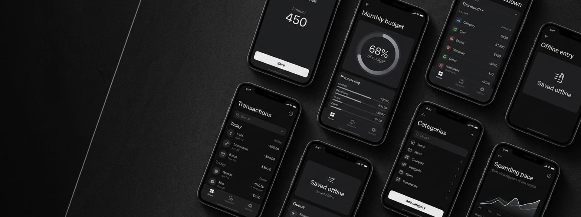
Personal finance apps do not fail because they lack features; they fail because logging an expense takes long enough that people stop. The brief was to build the fastest entry path we could — one screen, sensible defaults, works with no signal — and let every other decision in the product defer to that number.
Problem:
Every Second Of Friction Is A Missing Entry
The category is full of apps that ask for six fields per expense, and the result is always the same: people log diligently for a fortnight and then stop, because the record of what they spent is only useful if it is complete. The brief was not to build a richer finance app. It was to build one where adding a coffee takes less effort than remembering not to.
Key issues identified:
- Entry Too Slow To Sustain: Multi-field forms lose users in the second week, and an incomplete ledger is worth almost nothing.
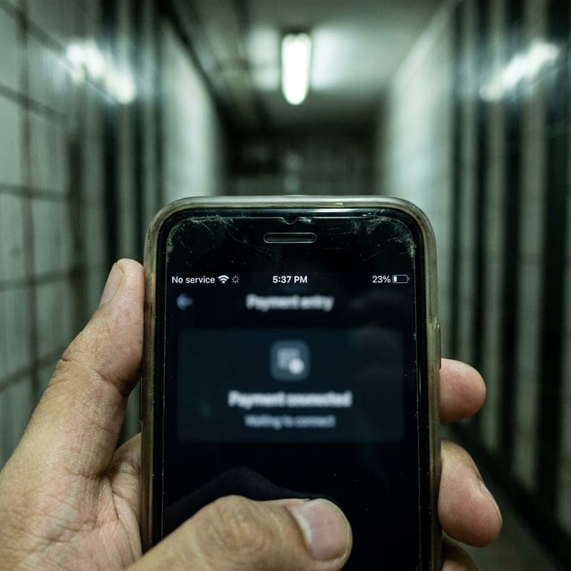
- Useless Without Signal: An expense happens at a till, sometimes underground — an app that needs connectivity misses exactly those moments.
- Numbers Without Meaning: A list of transactions is not insight; users need to see whether this month is going the way the last one did.


Solution:
One Screen, Under Five Seconds
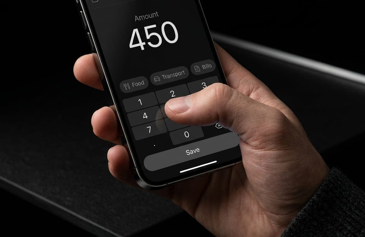
Entry is a single screen: amount on a large keypad, a category from recently-used tiles, and save. Date defaults to now, notes and receipts are optional and out of the way, and recurring bills post themselves. Everything writes to a local database first and syncs when there is signal, so the app is fully usable in a basement queue and never loses an entry to a failed request.
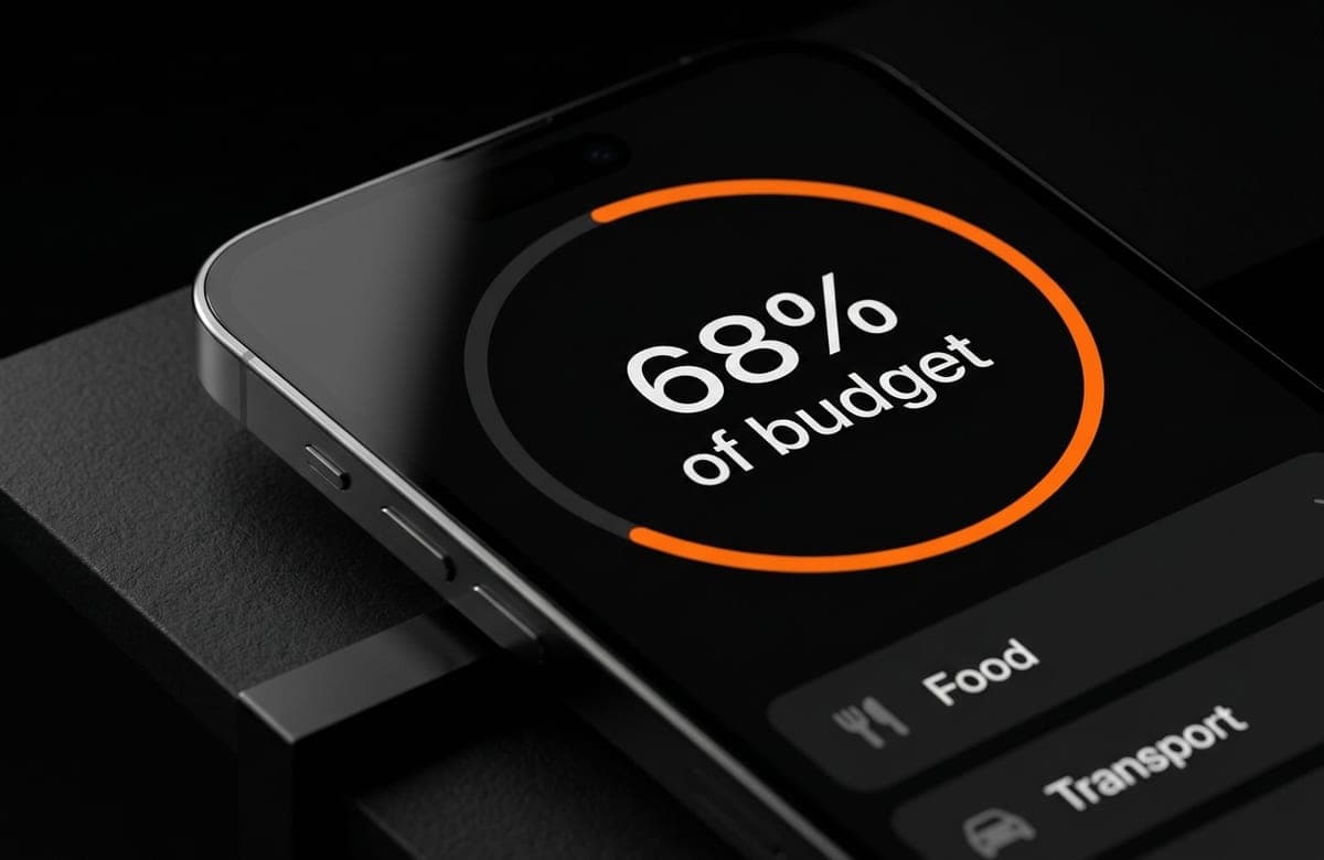
The insight side is deliberately narrow: spend by category this month against last, budget progress with a projection of where the month is heading at the current rate, and a plain list you can search. We shipped fewer charts than the client originally asked for, on the argument that a chart nobody reads is a chart that costs load time — and kept the entry path as the thing everything else defers to.
Key Takeaways:
Retention Was A Design Constraint, Not A Marketing Problem
Everything in this build was measured against one number: seconds from launching the app to a saved expense. That constraint killed features that would have looked good in a store listing and kept the ones people actually use daily. Cross-platform delivery from one codebase mattered too — a two-codebase build would have spent its budget on parity instead of on the entry path.
What this project reinforced:
- Optimise The Action People Repeat: Everything else in a finance app is secondary to logging a transaction.
- Offline-First Is A Product Decision: Where the action happens determines the architecture, not the other way round.
- Ship Fewer Charts: Insight the user does not read is weight the user pays for on every launch.
Outcomes & Impact:
Time To Log
< 5s
Amount, category, save — on one screen with sensible defaults, which is the number the whole app was designed against.
Codebases
1
iOS and Android ship from a single React Native codebase, so feature work lands on both platforms in the same sprint.
Offline Entry
Always
Every expense writes locally first and syncs when signal returns, so an entry is never lost to a failed request.
Recurring Bills
Automatic
Rent, subscriptions and utilities post themselves on schedule instead of relying on the user to remember them.

Questions We GetAsked Most
Still have questions?
Ask us anything
// A focused MVP usually ships in 8–12 weeks. Larger SaaS platforms and multi-tenant systems run 4–6 months, delivered in two-week increments so you see working software throughout rather than at the end.